Valmore.online

Product landing page

UI/UX DESIGN

  • case study

    Valmore approached us with the task of designing a landing page for Albiodex, nutritional syrup aimed at children and parents. The challenge? Creating a trustworthy, easy-to-understand, and emotionally resonant digital experience in a highly saturated and sensitive market.
  • Solution

    Our goal was to craft a clean, medical-inspired digital presence that feels both trustworthy and approachable. 
We focused on clarity, calm color palettes, and visual hierarchy that highlights key benefits and ingredients without overwhelming users.
  • Tech Stack

UX Research

The UX process began with defining user personas. Parents seeking reliable nutritional support for their children, and doctors who would recommend the product.
We mapped out key user journeys, from first impression to conversion, ensuring the information was structured for both trust-building and simplicity.

Usability and emotional resonance were prioritized throughout the flow, with emphasis on clear messaging, minimal friction, and responsive accessibility across all devices.
The design guides visitors smoothly toward understanding the product and encourages consultation with healthcare providers.

This project was created in collaboration with Makasa Digital, where I contributed as part of the DEV team. My role focused solely on the UX/UI design, prototyping, and research phases.

  • Competitor analysis

    I analyzed the nutritional supplement market and its key competitors. Most sites felt overly clinical or text-heavy, lacked clear hierarchy, and often created confusing journeys for parents.

  • User Persona

    One of the primary audiences for the landing page are parents of young children. They want trustworthy supplements and clear, simple information. The design uses friendly visuals, simple language, and a structured layout to build trust.

  • Epic

    The project focused on creating a clear, parent-friendly experience that communicates the product’s purpose and benefits. Each epic aimed to simplify the user journey and maintain a clean, accessible design across all devices.

  • Wireframe and Styles

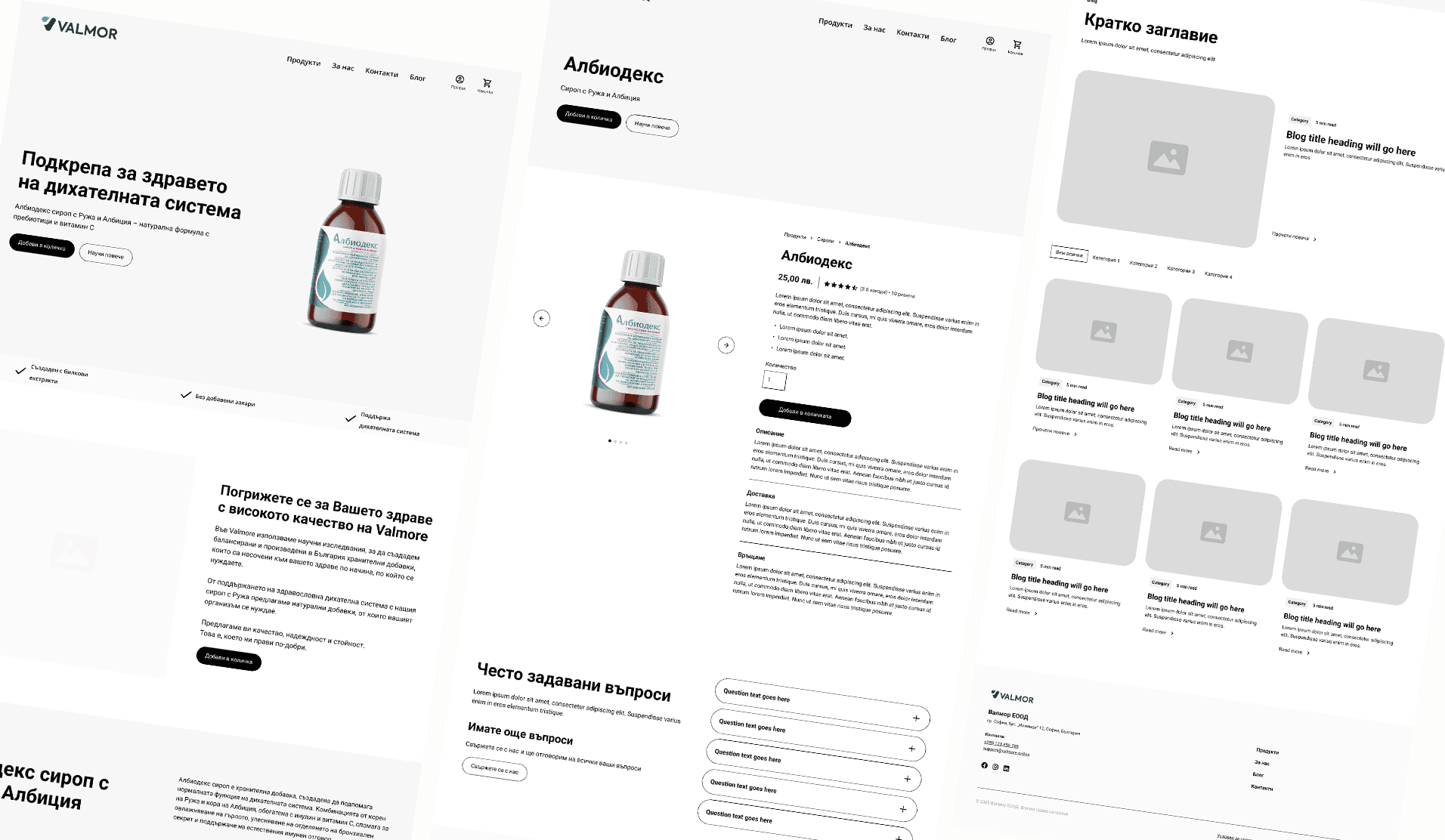
  • Wireframing

    Low-fidelity wireframes were created to establish the structure and flow of information. The layout was built around a clear visual rhythm, alternating sections for storytelling, product benefits, and scientific validation.
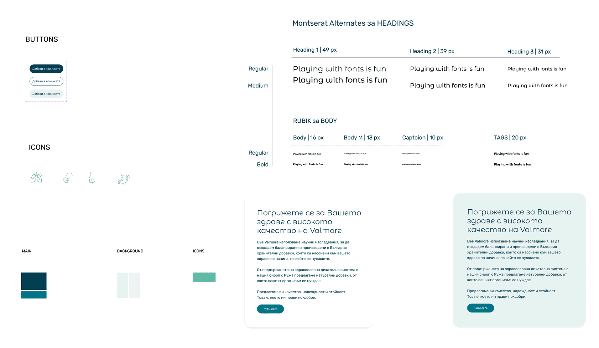
  • Styles and Components

    The visual direction followed a clean, medical aesthetic – light backgrounds, generous white space, and subtle gradients that evoke a sense of calm and professionalism. The color palette combines soft blues and whites for trust and cleanliness.
  • Problem solved

    This section highlights the key challenges discovered throughout the project and the solutions that shaped a clearer, more intuitive user experience.

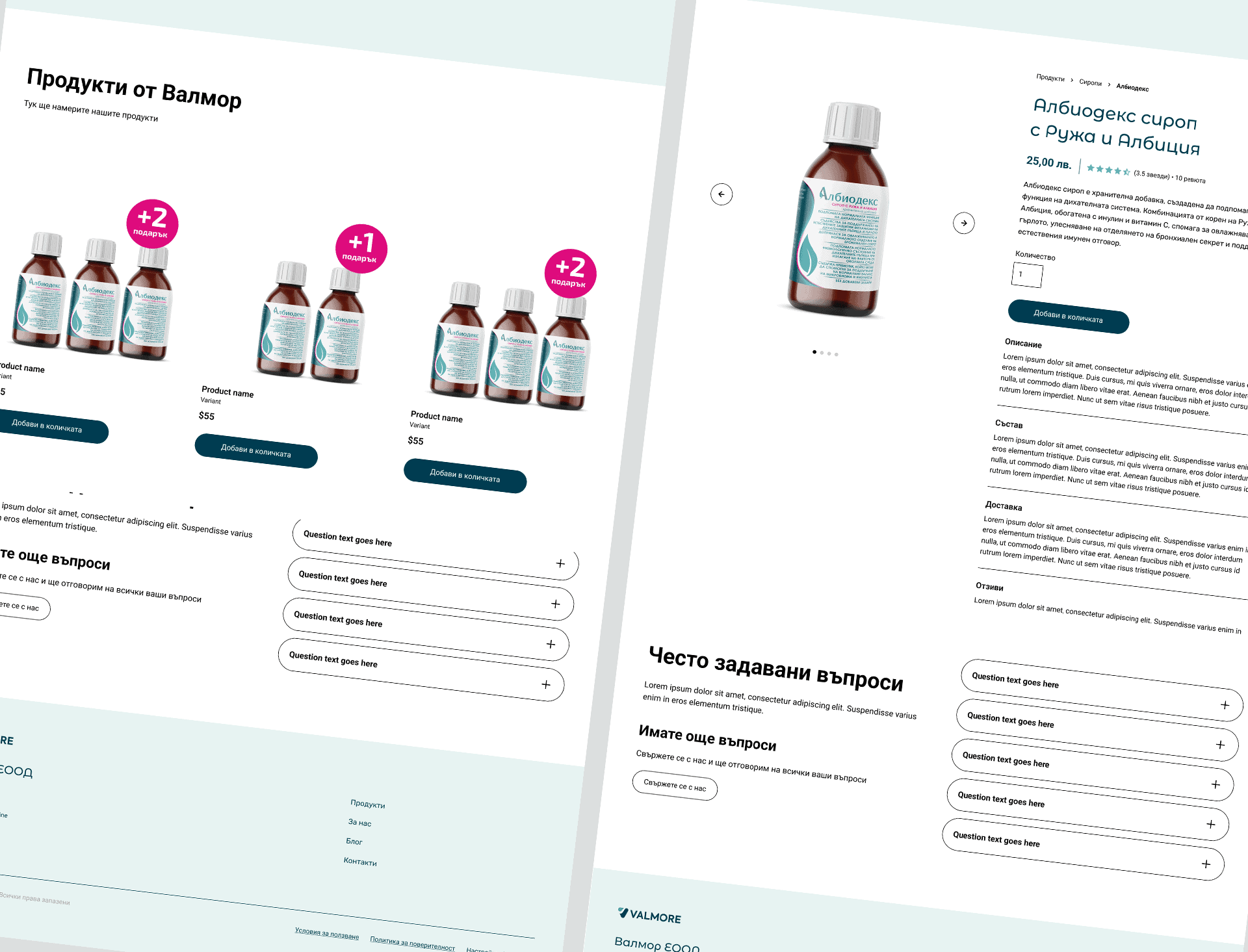
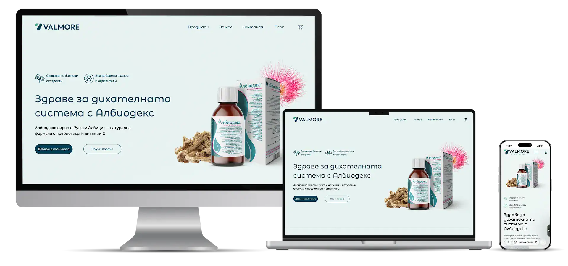
    How it looks the final UI

    Start Your Project