Greenlinemobile.bg

E-commerce for mobile services

UI/UX DESIGN

  • case study

    The client approached us with the need to improve the usability and visual appeal of their website, which had become outdated and difficult to navigate. The goal was to enhance the user experience, address pain points, and align the design more closely with the brand’s evolving identity and business goals.
  • Solution

    Redesign the website with a user-centered approach by identifying usability issues, understanding user needs, and creating a seamless, engaging, and intuitive digital experience. UX research, user flows, personas, wireframes, UI design,
  • Tech Stack

UX Research

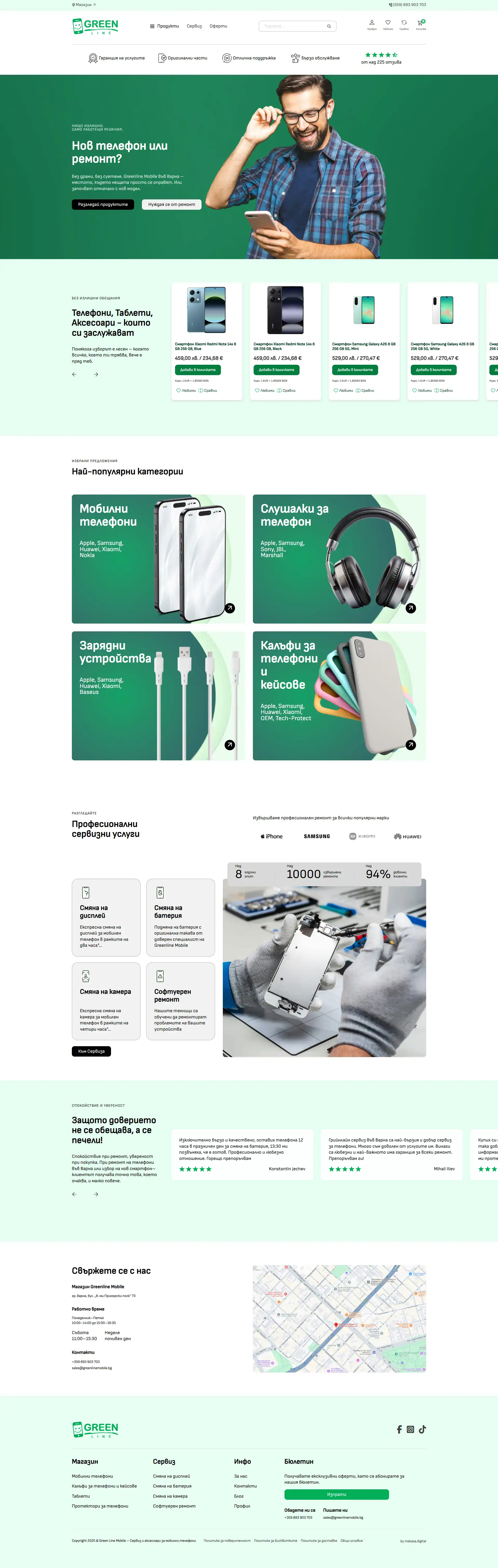
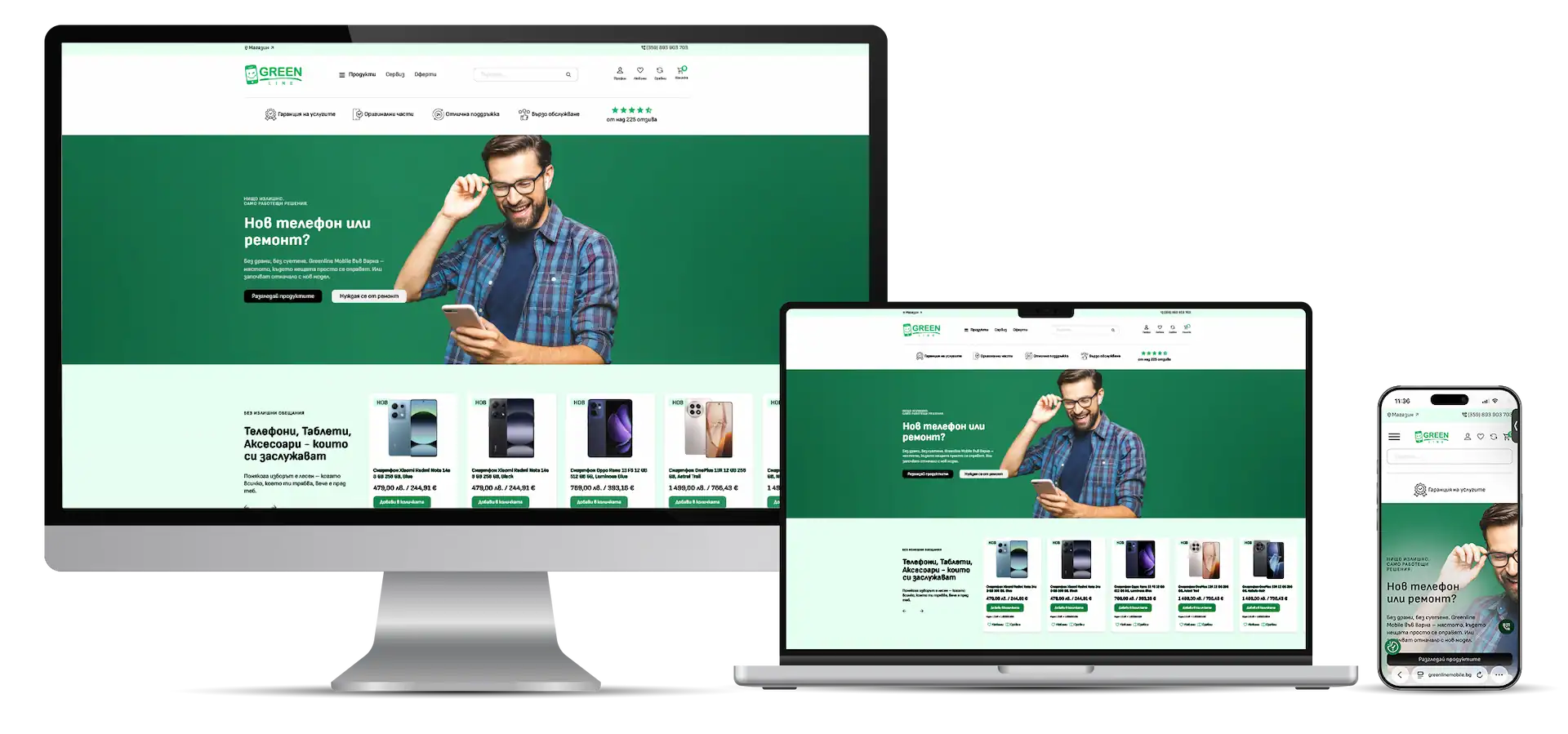
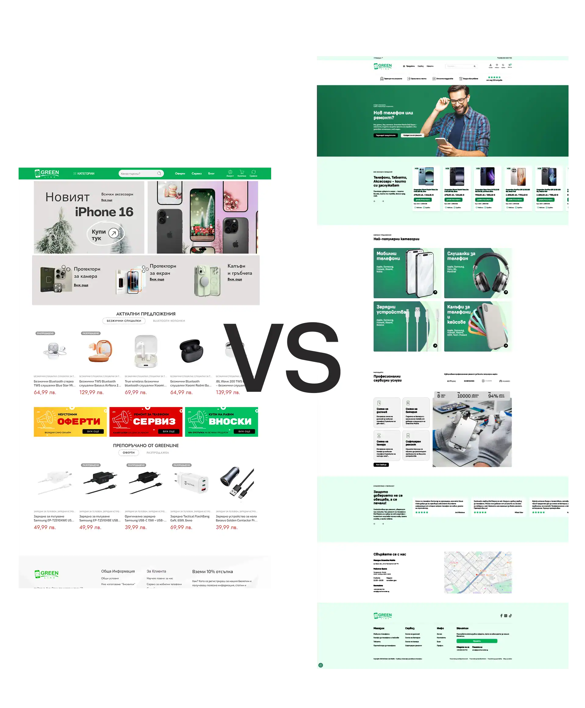
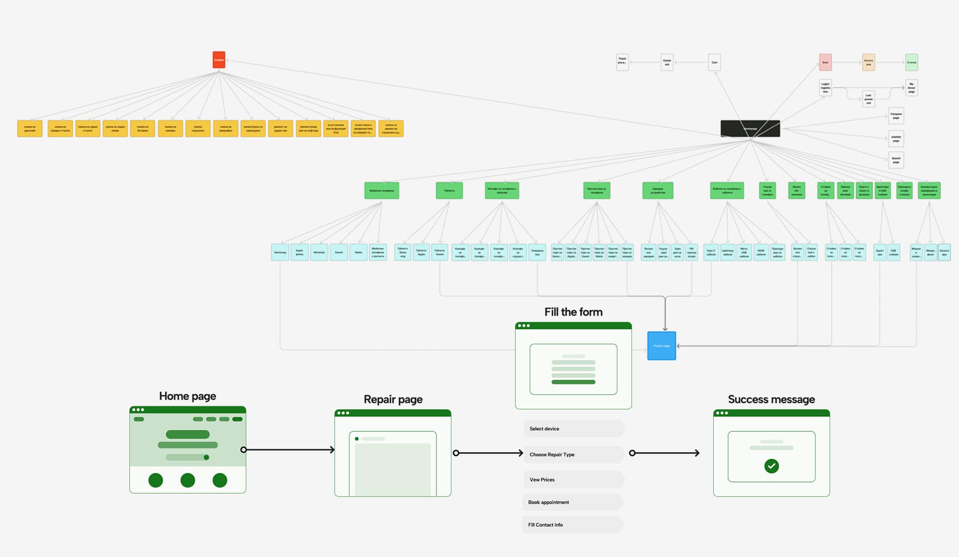
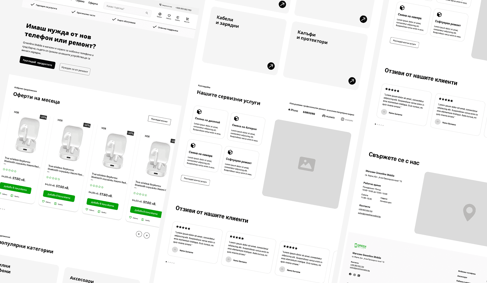
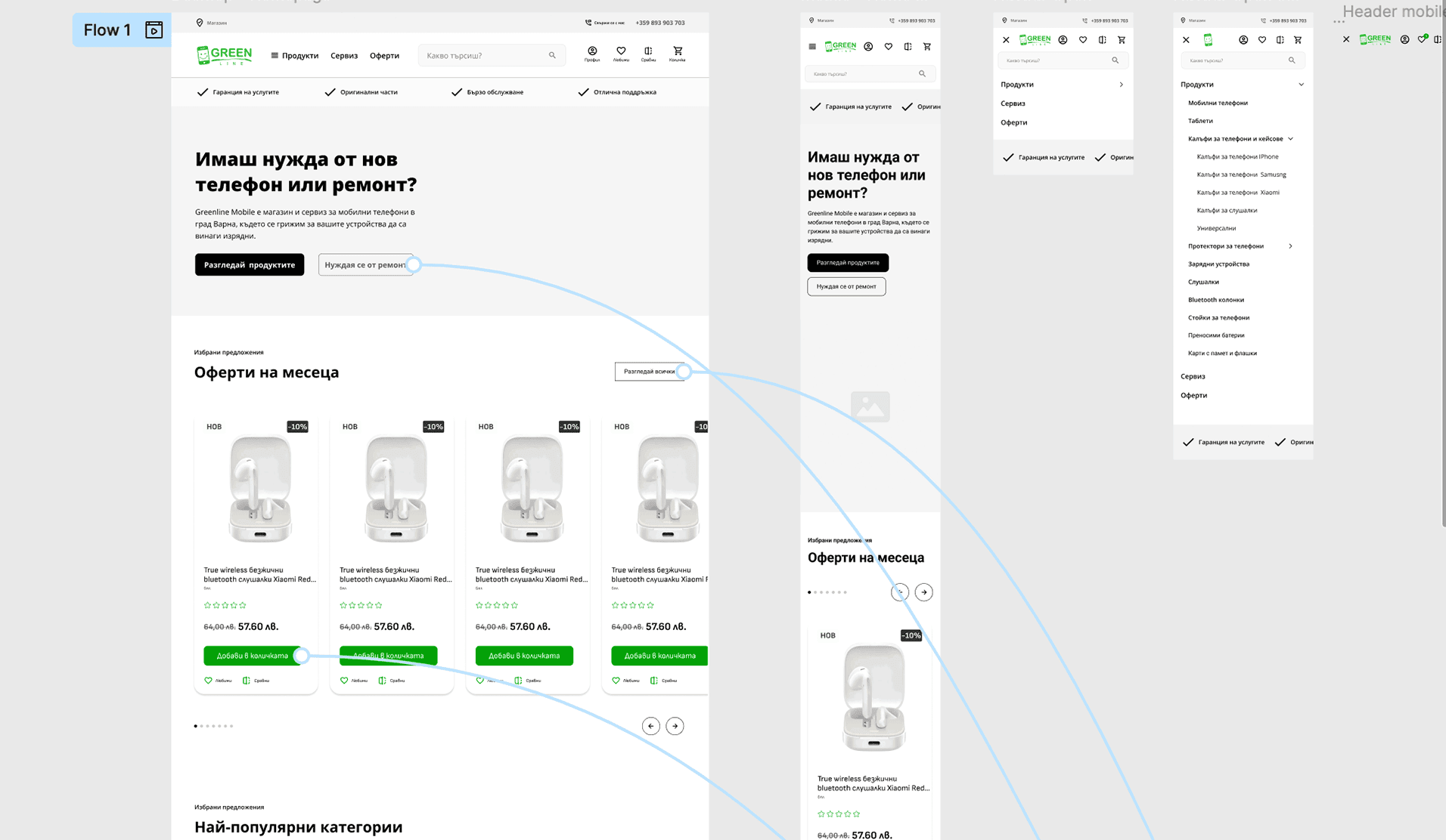
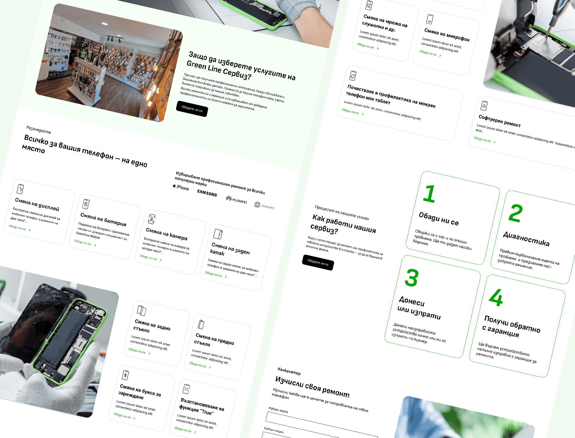
The previous website suffered from significant navigational issues, ambiguous, and non-functional banners, necessitating a complete re-evaluation of the entire site structure and user experience. Our redesign focused heavily on clarifying the navigation and prominently featuring the mobile phone repair service section to address a key business need.

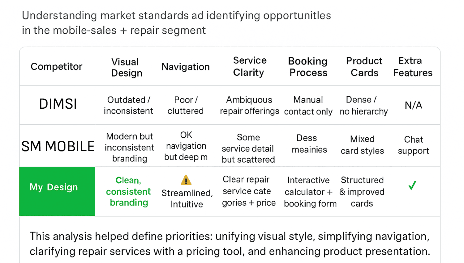
To establish a strong foundation, I was comprehensively audited the existing product, involving a deep analysis of user reviews and support tickets to pinpoint recurring pain points and areas for improvement. This data, combined with insights from user behavior and feedback, was synthesized to define key user personas, map core business elements, and outline user flows. Furthermore, a thorough competitor analysis was conducted to benchmark UX patterns and identify viable opportunities for product differentiation.

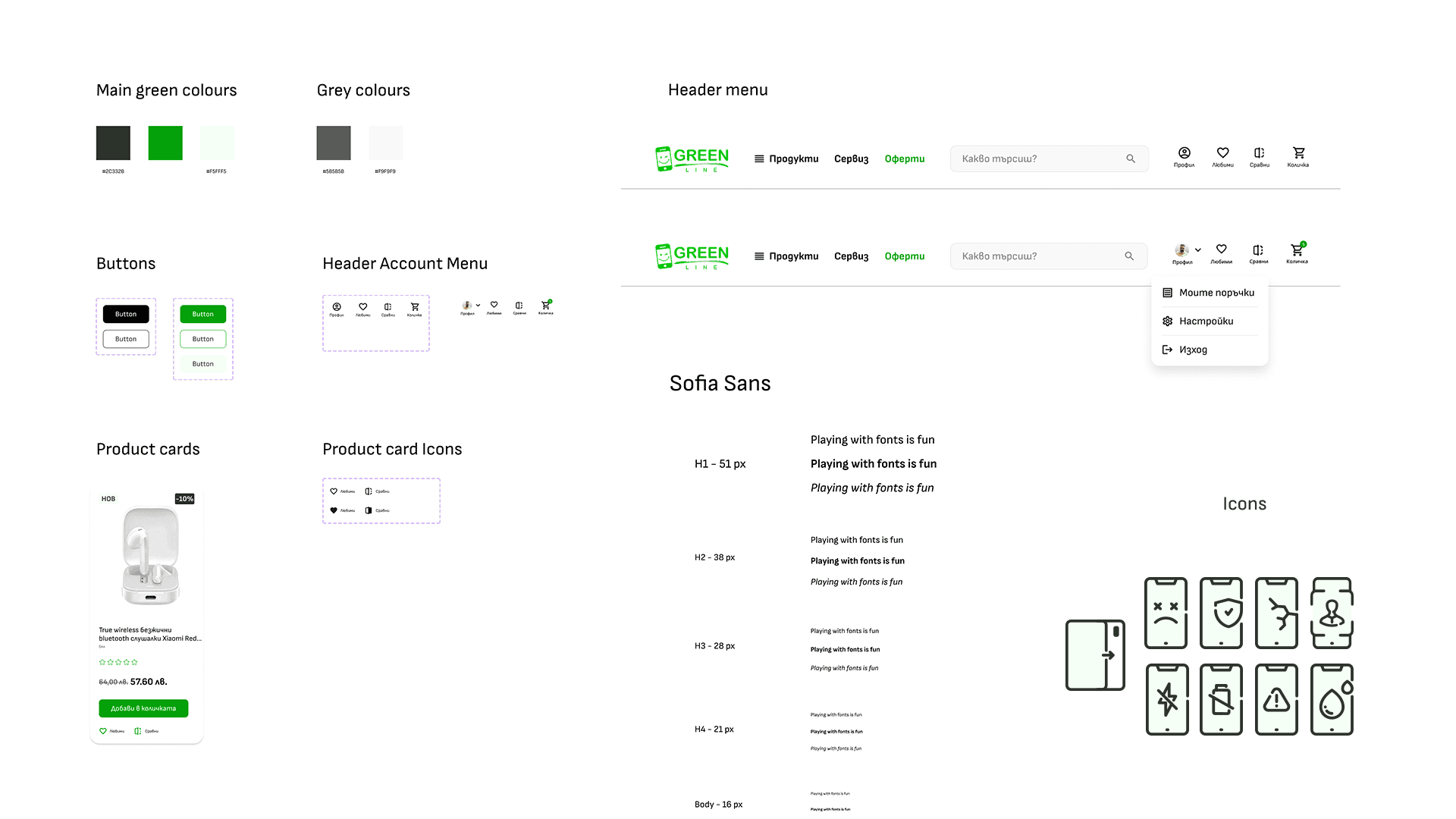
As a member of the Makasa Digital DEV team, my primary role was managing the design processes and conducting essential UX research to drive this structural and functional overhaul.

  • Competitor analysis

    I conducted an independent competitive analysis of mobile repair websites in the Varna region. The research highlighted key UX issues and revealed opportunities to improve navigation, clarity, and overall trust in Greenline Mobile’s interface.

  • User Persona & Epic

    EPIC 1: As a user, I want to schedule a repair appointment online, so I don’t waste time waiting in-store.

    EPIC 2: As a customer, I want to see clear prices and service details upfront.

  • Final Sitemap

    I focused on making the site immediately intuitive by using clear, consistent labels and navigation menus that users are already familiar with. This approach ensures users can instantly recognize where to go, making it easy for them to find content..

  • Wireframing & Prototyping

  • Wireframing

    Display of the new structure and improvements on the site map After defining the problem space and user needs, I created low-fidelity wireframes to test layout and navigation ideas.
  • Prototyping

    Interactive prototypes were developed to test usability and validate key interactions. Through iterative testing, ensuring a smooth and responsive user experience across different devices.
  • Problem solved

    This section highlights the key challenges discovered throughout the project and the solutions that shaped a clearer, more intuitive user experience.

    How it looks the final UI

    Styles and components

    The design system became a single source of truth for the design and development teams.

    Start Your Project