DVRS.BG

Communication agency website

UI/UX DESIGN

  • case study

    DVRS is a Communication agency working with high-profile clients such as Coca-Cola and government institutions. The client wanted a modern, visually engaging website that would serve as an image-focused presentation for potential partners and clients. The goal was to create a creative and stylish online presence that highlights their best projects, without relying on heavy text or typical corporate layouts.
  • Solution

    My approach focused on designing a clean yet expressive digital identity that communicates DVRS’s creativity. I began with competitor research and mood boards to define the visual direction, blending minimalism with bold accents to reflect originality. The final design combines simplicity, intuitive navigation, and storytelling visuals that elevate the agency’s brand.
  • Tech Stack

UX Research

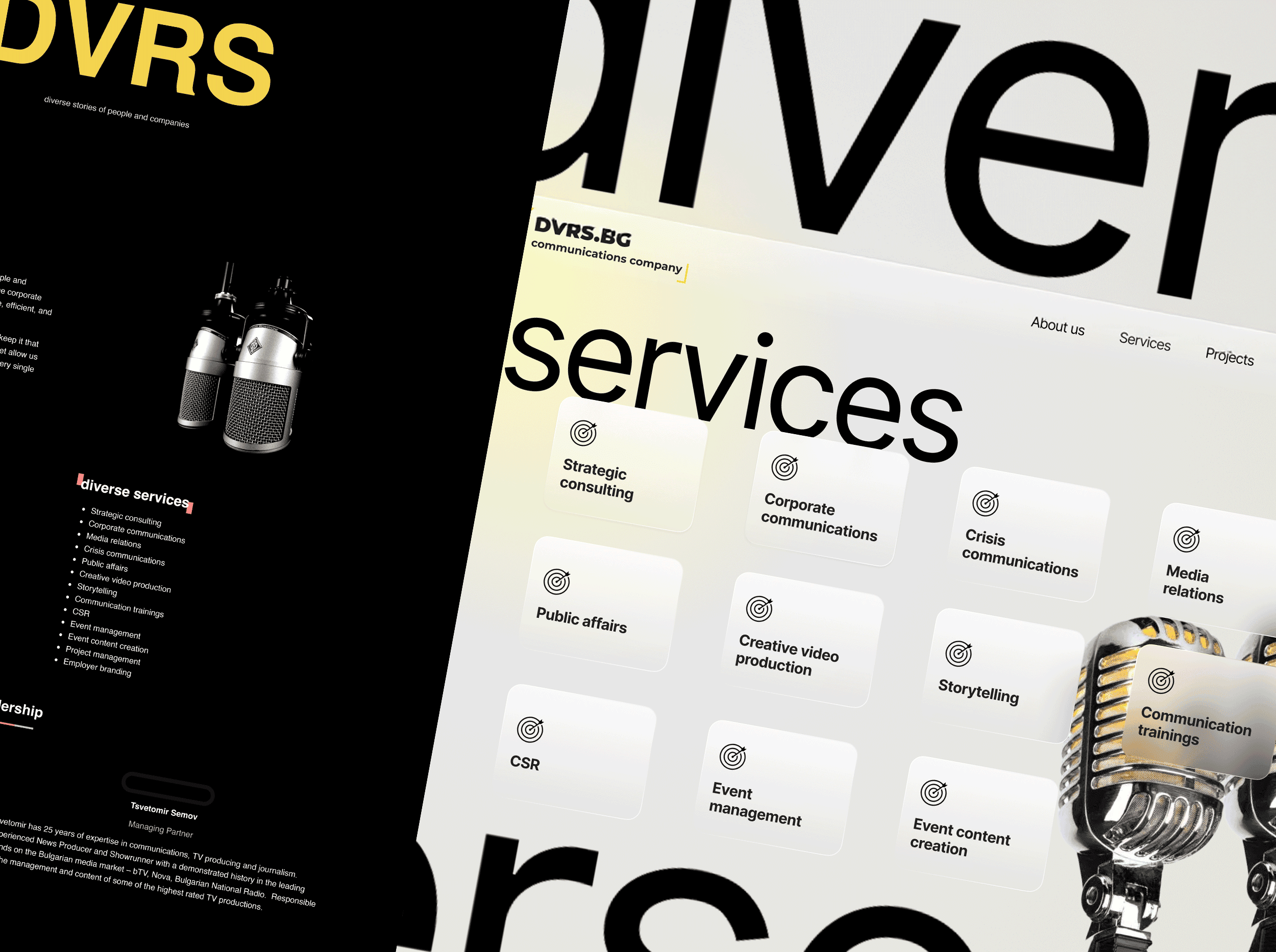
The UX process started with stakeholder interview to understand business goals and user expectations. I analyzed how potential clients would explore the site, focusing on quick access to key information and project showcases.

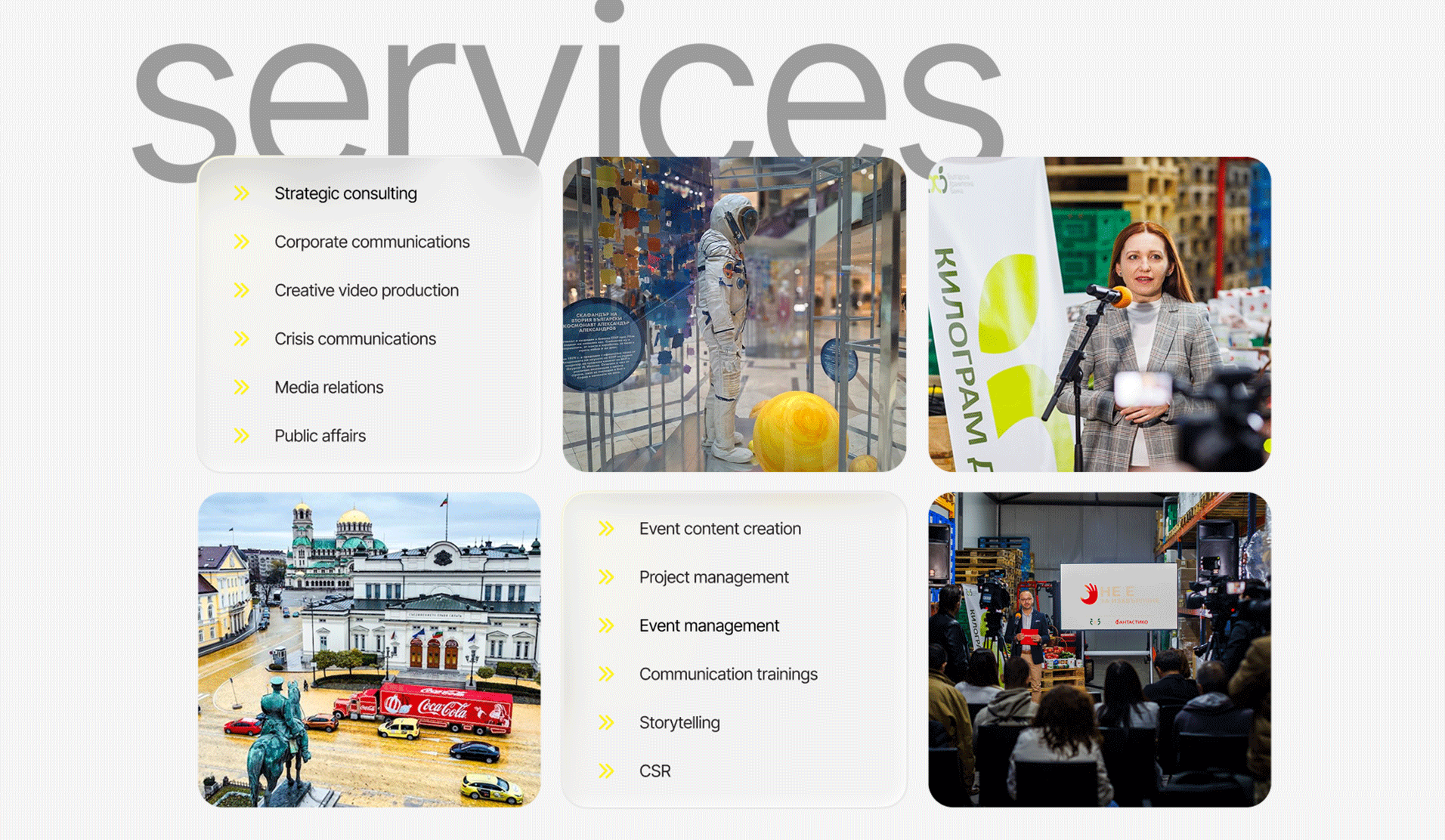
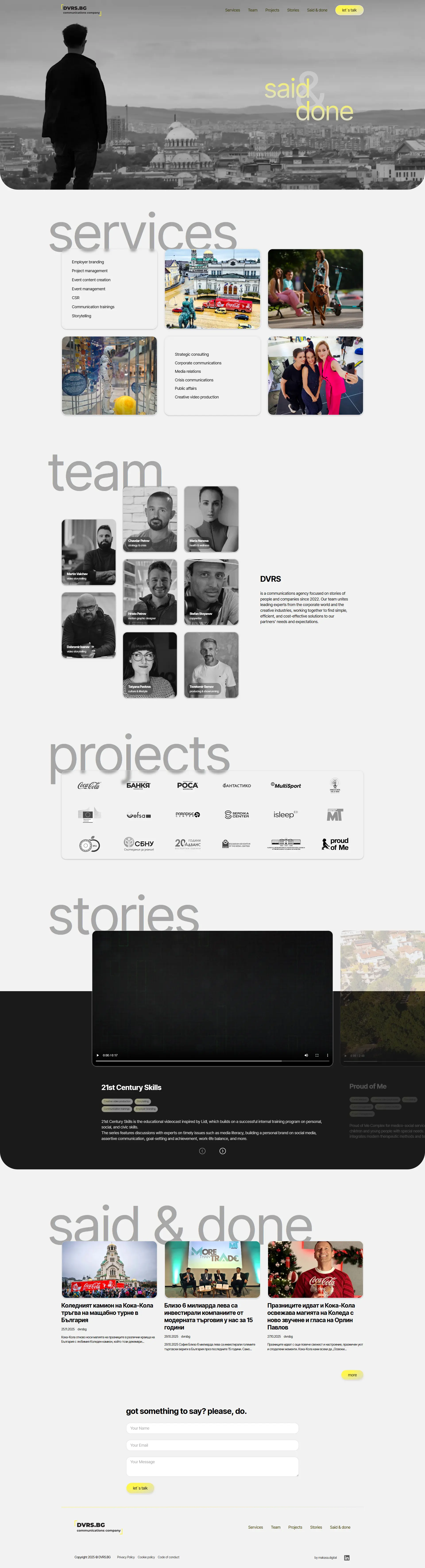
At the beginning of the design process, the website concept included a dedicated “Projects” page featuring an extensive portfolio of DVRS’s past work. However, during the later stages of development, the client decided to simplify the structure. They wanted the projects to be showcased only on the homepage, limited to three key case studies.

This decision reflected the agency’s position in the industry, as a well-established Communication company already recognized by major brands and institutions, they didn’t need a large portfolio to prove credibility. Instead, the focus shifted to presenting only their most significant and recent projects, emphasizing quality over quantity and maintaining a clean, minimal layout.

  • Design process – service section

    The “Services” section went through several design iterations based on client feedback. The client requested a minimalist layout with no unnecessary visual clutter.

  • service section- First Glance

    After multiple revisions, the final design achieved a clean and spacious composition, using clear typography, subtle animations, and visual balance to emphasize each service.

  • service section – Final Glance

    The simplicity of the final section communicates confidence and professionalism without overwhelming the viewer.

  • Wireframe and Styles

  • Wireframing

    Wireframes were tested to ensure an effortless flow between pages, emphasizing discovery and trust. The result was a streamlined user journey with clear hierarchy and smooth interactions.
  • styles and components

    I introduced a glass effect on the project cards to give the interface a contemporary and polished feel. The color palette was derived directly from the brand’s logo, combining yellow, black, and gray tones to ensure consistency and strong visual identity
  • Problem solved

    This section highlights the key challenges discovered throughout the project and the solutions that shaped a clearer, more intuitive user experience.

    How it looks the final UI

    Start Your Project